
Home |
Research |
Courses |
Personal |
CS6630 -- Project 2
Dafang
1. PART A
Script Used: “ PartA.tcl ”
Use information for the script:
The UI is
straightforward. Switch between different objects, height/plane visualization
modes, and HSV/RGB color spaces
Technical Point:
To create color
entry for the RGBA color lookup table, I use a special interpolation function
to make the color space as wide and diversified as possible. This design will
make minor difference in RGB color more distinguishable.
My strategy is,
starting from the blue point in RGB space (0,0,1), first we fix red=0 and
change color to green point ((0,1,0) in RGB space), then fix blue=0 and change
color to red point ((1,0,0)) in RGB space. In this color lookup-table, blue
represents the minimum value, red represents the maximum, and the green
represents the middle value. This spectrum is much better than linear
interpolation between red and blue, which is grey in the middle.
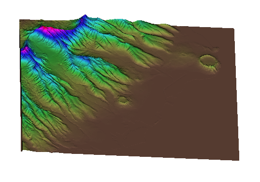
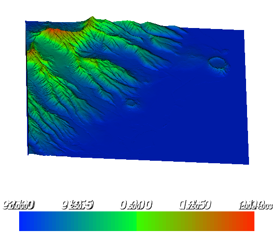
The visualization effect in height field:
For each object in
the following pictures, the LEFT image is from the HSV color space and the
RIGHT image is from the RGB color space. Also I list a table which tells the
range of each component in HSV/RGB color space where the color is mapped to.
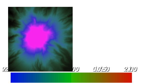
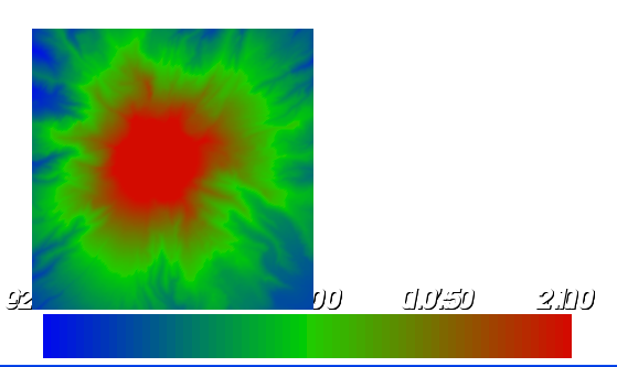
The thorax:
HSV Model |
Min |
Max |
RGB Model |
Min |
Max |
H |
0 |
1 |
R |
0.51 |
1.0 |
S |
0.15 |
0.84 |
G |
0.19 |
0.85 |
V |
0.25 |
0.83 |
B |
0.13 |
0.85 |
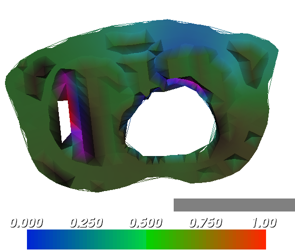
In this case, RGB
space is better than HSV space. The reason is most data in the thorax has very
similar hue value, so when I change the start/end point, all the HSV colors
change at the same time, but still keep a very small distance.
In contrast, RGB
performs much better. You can see all the color spectrum is covered quite
evenly. Also I try to make a large color spectrum available for visualization,
as I mentioned above. We can represent small difference by colors, which is
much better than represent them by saturation or intensity.
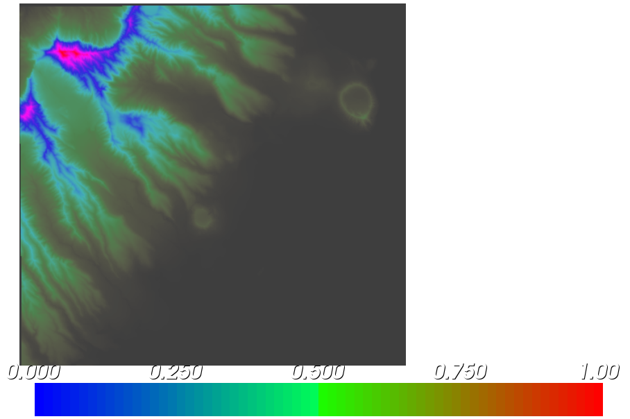
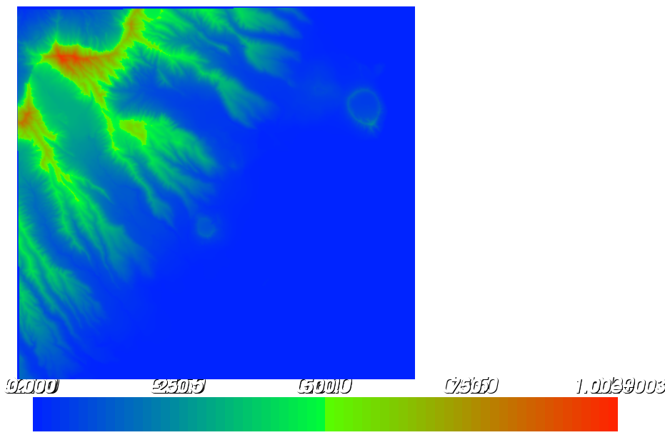
MtHood:
HSV Model |
Min |
Max |
RGB Model |
Min |
Max |
H |
0.16 |
1.00 |
R |
0.23 |
0.9 |
S |
0.33 |
0.83 |
G |
0.07 |
0.85 |
V |
0.23 |
1.00 |
B |
0 |
10 |
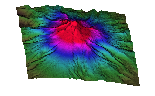
In this case, HSV
and RGB are quite similar. In experiment I noticed that hue controls the with of cyan, blue, purple and red bands. The smaller the hue range, the narrower the width of these bands. Saturation controls the vividness of each color, and V controls the total
intensity of the image.
In RGB space, the
data value is directly related to a color component. The reason both methods
are similar is due to the fact that the data makes a difference in hue space.
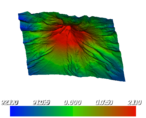
In Part B, I include a
dataset for the elevation in
HSV Model |
Min |
Max |
RGB Model |
Min |
Max |
H |
0 |
1 |
R |
0.22 |
1.0 |
S |
0.15 |
0.84 |
G |
0.16 |
1.0 |
V |
0.25 |
0.83 |
B |
0.17 |
1.0 |
For clearance, the
HSV plays the same as RGB space. But the visualization of RGB space is more
natural, especially for the sea.
The hue range
controls the highlight part of the left image: the red, pink and blue regions
on the mountain peak and ridge. If we narrow the hue range, those regions will
be sharp and highlighted. The saturation controls the green and cyan part of
the image. The intensity controls the color of the sea. If the minimum
intensity value is small, the sea will become black.
In summary, for
height field visualization, the RGB color space is better than the HSV color
space. The most noticeable advantage of RGB space is its ability to visualize
small differences in data. Also all the colors in the color spectrum are evenly
covered by the image, where HSV model usually only uses part of the color
spectrum.
Visualzation effect on plane
In each case, the
left image is from HSV color space and the right image comes from the RGB color
space.
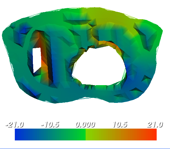
Thorax:
HSV Model |
Min |
Max |
RGB Model |
Min |
Max |
H |
0.28 |
0.78 |
R |
0.51 |
1.0 |
S |
0.3 |
0.85 |
G |
0.19 |
0.85 |
V |
0.12 |
1.0 |
B |
0.13 |
0.85 |
In this case,
obviously the RGB is better than HSV.
MtHood:
HSV Model |
Min |
Max |
RGB Model |
Min |
Max |
H |
0.16 |
0.85 |
R |
0.12 |
0.83 |
S |
0.07 |
0.72 |
G |
0.04 |
0.81 |
V |
0.25 |
0.83 |
B |
0.13 |
0.85 |
In this case, it’s
hard to compare HSV and RGB model. The HSV model can make the very sharp
boundaries between regions, and make them contrast dramatically. But it won’t
change the portion of each color area much. The RGB model can’t make very sharp
boundaries, but it can easily change the red, green and blue proportion.
HSV Model |
Min |
Max |
RGB Model |
Min |
Max |
H |
0.1 |
1 |
R |
0.1 |
1.0 |
S |
0. |
1 |
G |
0.12 |
0.95 |
V |
0.33 |
1 |
B |
0.3 |
0.86 |
In this case, the HSV makes a good visualization for two holes in the sea. The RGB model only uses very similar blue color to represent the sea and the holes. But again the RGB image looks more natural.
Answer to questions in Part A & B:
1. What do you
think works best, or what are the benefits of the different approaches?
From all the data
samples above, color map on the height field is more illustrative than the
color-mapped plane.
2. Bivariate Colormaps
Script Used: “PartC.tcl”
Use information for the script:
Each time this program only visualize one data set. In order to
generate all the image, you must change the data
reader in the code each time.
Technical Points
For each point in
the space, I treat the low-order 8 bits and high-order 8 bits of the data as
two variables x and y. Then I normalize each (x,y) dipole into [-1,1]*[-1,1] space. To build the
color lookup-table, I need to map each normalized (x,y) to a unique color.
After transforming
(x,y) into (magnitude,
theta) coordinates, I tried to 2 colormaps.
The first way is
map theta to hue and map magnitude to saturation in HSV space.
The second way is
to map theta to hue and map magnitude to intensity in HSV space.
It turns out that
the second way is better than the first method. First, the change in intensity
is more distinguishable than saturation. Second, in case that magnitude is
close to zero, it doesn’t make much difference what the vector direction is.
For the two discs
below, the first one is more reasonable than the second one. Those points close
to the circle center has small magnitude and small intensity and look pretty
dark. But points around the center has significantly different color in the
second disc, it doesn’t fit the actual situation. Also you can see the color
changes radially in the first image, but it doesn’t
changes so much radially in the second image. All
these points to my conclusion that hue/intensity space is better than
hue/saturation space for bivariate.
The Disc mapped to hue/intensity space, “disc-8.png”:
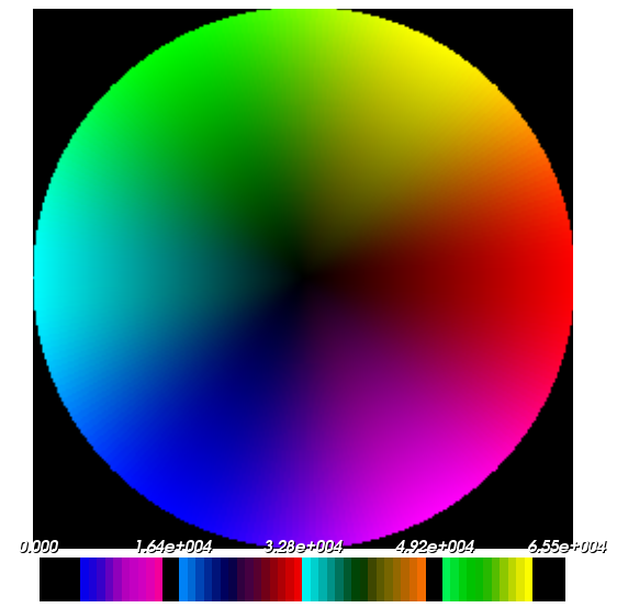
The Disc mapped to
hue/saturation space
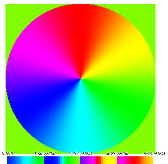
The image
generated from hue/intensity colormap for each
dataset:
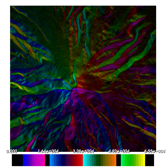
Mt Hood: “MtHood-8.png”
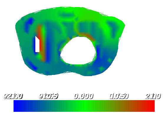
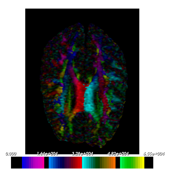
Symmetric Brain:
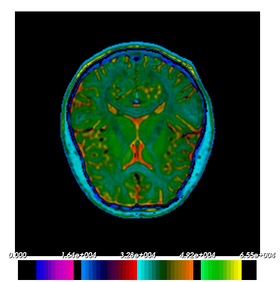
Non-Symmetric Brain:
Answers to Questions
in Part B and CS6630 Assignment
1. What is visually wrong with the color map of the
thorax data?
From the thorax
data I noticed that the order of the color doesn’t coincide with the order of
the value. The red color should represent the largest data value while the blue
color should represent the minimum data value. But actually it’s not like what
it should be. For example, on the left image of the height field thorax, the
red region are right next to the blue region, which means the maximum value and
minimum value are connected without any intermediate value.
Also some place
around the empty heart, different height shares the same color.
2.
What is causing this?
I guess this comes
from the interpolation between the value at two
points. If their difference is large but distance is small, then interpolation from neighboring points are not accurate.
Also, the data value and HSV/RGB components usually doesn’t change in the same
direction. This will cause some unconscious visual errors. For example, it’s
hard to represent the change of data value with an increase in vividness and
decrease in intensity in the same time.
To avoid these
“artifacts”, we must design a colormap in which each
color entry is well-refined and evenly distributed in the color spectrum, and
monotonically change along one direction.
3. Are there differences between what works better for
the two brain datasets?
Of course there
is. For radially symmetric data, we need to map –v
and v into same color. This requirement leads to a symmetric disc. But this
mapping will make (x,y) and
(-x, -y) have the same color in non-symmetric data, which is obvious wrong. For
example, in meterological data, (20F in temperature,
100Pa in pressure) and (-20F, -100Pa) is totally different and can’t have same
color.