
Visualization
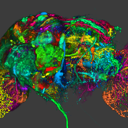
Visualization, sometimes referred to as visual data analysis, uses the graphical representation of data as a means of gaining understanding and insight into the data. Visualization research at SCI has focused on applications spanning computational fluid dynamics, medical imaging and analysis, biomedical data analysis, healthcare data analysis, weather data analysis, poetry, network and graph analysis, financial data analysis, etc.Research involves novel algorithm and technique development to building tools and systems that assist in the comprehension of massive amounts of (scientific) data. We also research the process of creating successful visualizations.
We strongly believe in the role of interactivity in visual data analysis. Therefore, much of our research is concerned with creating visualizations that are intuitive to interact with and also render at interactive rates.
Visualization at SCI includes the academic subfields of Scientific Visualization, Information Visualization and Visual Analytics.


Mike Kirby
Uncertainty Visualization

Alex Lex
Information Visualization
Centers and Labs:
- Visualization Design Lab (VDL)
- CEDMAV
- POWDER Display Wall
- Modeling, Display, and Understanding Uncertainty in Simulations for Policy Decision Making
- Topological Data Analysis for Large Network Visualization
Funded Research Projects:
Publications in Visualization:
 Visual Exploratory Analysis for Designing Large-Scale Network-on-Chip Architectures: A Domain Expert-Led Design Study, S. Wang, H. Yan, K.E. Isaacs, Y. Sun. In IEEE Transactions on Visualization and Computer Graphics, Vol. 30, pp. 1970-1983. 2024. Visualization design studies bring together visualization researchers and domain experts to address yet unsolved data analysis challenges stemming from the needs of the domain experts. Typically, the visualization researchers lead the design study process and implementation of any visualization solutions. This setup leverages the visualization researchers' knowledge of methodology, design, and programming, but the availability to synchronize with the domain experts can hamper the design process. We consider an alternative setup where the domain experts take the lead in the design study, supported by the visualization experts. In this study, the domain experts are computer architecture experts who simulate and analyze novel computer chip designs. These chips rely on a Network-on-Chip (NOC) to connect components. The experts want to understand how the chip designs perform and what in the design led to their performance. To aid this analysis, we develop Vis4Mesh, a visualization system that provides spatial, temporal, and architectural context to simulated NOC behavior. Integration with an existing computer architecture visualization tool enables architects to perform deep-dives into specific architecture component behavior. We validate Vis4Mesh through a case study and a user study with computer architecture researchers. We reflect on our design and process, discussing advantages, disadvantages, and guidance for engaging in a domain expert-led design studies. |
 Loops: Leveraging Provenance and Visualization to Support Exploratory Data Analysis in Notebooks K. Eckelt, K. Gadhave, A. Lex, M. Streit. In Computer Graphics Forum, 2024. Exploratory data science is an iterative process of obtaining, cleaning, profiling, analyzing, and interpreting data. This cyclical way of working creates challenges within the linear structure of computational notebooks, leading to issues with code quality, recall, and reproducibility. To remedy this, we present Loops, a set of visual support techniques for iterative and exploratory data analysis in computational notebooks. Loops leverages provenance information to visualize the impact of changes made within a notebook. In visualizations of the notebook provenance, we trace the evolution of the notebook over time and highlight differences between versions. Loops visualizes the provenance of code, markdown, tables, visualizations, and images and their respective differences. Analysts can explore these differences in detail in a separate view. Loops not only improves the reproducibility of notebooks but also supports analysts in their data science work by showing the effects of changes and facilitating comparison of multiple versions. We demonstrate our approach’s utility and potential impact in two use cases and feedback from notebook users from various backgrounds. |
Design Concerns for Integrated Scripting and Interactive Visualization in Notebook Environments C. Scully-Allison, I. Lumsden, K. Williams, J. Bartels, M. Taufer, S. Brink, A. Bhatele, O. Pearce, K. Isaacs. In IEEE Transactions on Visualization and Computer Graphics, IEEE, 2024. DOI: 10.1109/TVCG.2024.3354561 Interactive visualization can support fluid exploration but is often limited to predetermined tasks. Scripting can support a vast range of queries but may be more cumbersome for free-form exploration. Embedding interactive visualization in scripting environments, such as computational notebooks, provides an opportunity to leverage the strengths of both direct manipulation and scripting. We investigate interactive visualization design methodology, choices, and strategies under this paradigm through a design study of calling context trees used in performance analysis, a field which exemplifies typical exploratory data analysis workflows with Big Data and hard to define problems. We first produce a formal task analysis assigning tasks to graphical or scripting contexts based on their specificity, frequency, and suitability. We then design a notebook-embedded interactive visualization and validate it with intended users. In a follow-up study, we present participants with multiple graphical and scripting interaction modes to elicit feedback about notebook-embedded visualization design, finding consensus in support of the interaction model. We report and reflect on observations regarding the process and design implications for combining visualization and scripting in notebooks. |
| Estimation and Analysis of Slice Propagation Uncertainty in 3D Anatomy Segmentation Subtitled “arXiv preprint arXiv:2403.12290,” R. Nihalaani, T. Kataria, J. Adams, S.Y. Elhabian. 2024. Supervised methods for 3D anatomy segmentation demonstrate superior performance but are often limited by the availability of annotated data. This limitation has led to a growing interest in self-supervised approaches in tandem with the abundance of available unannotated data. Slice propagation has emerged as an self-supervised approach that leverages slice registration as a self-supervised task to achieve full anatomy segmentation with minimal supervision. This approach significantly reduces the need for domain expertise, time, and the cost associated with building fully annotated datasets required for training segmentation networks. However, this shift toward reduced supervision via deterministic networks raises concerns about the trustworthiness and reliability of predictions, especially when compared with more accurate supervised approaches. To address this concern, we propose the integration of calibrated uncertainty quantification (UQ) into slice propagation methods, providing insights into the model’s predictive reliability and confidence levels. Incorporating uncertainty measures enhances user confidence in self-supervised approaches, thereby improving their practical applicability. We conducted experiments on three datasets for 3D abdominal segmentation using five UQ methods. The results illustrate that incorporating UQ improves not only model trustworthiness, but also segmentation accuracy. Furthermore, our analysis reveals various failure modes of slice propagation methods that might not be immediately apparent to end-users. This study opens up new research avenues to improve the accuracy and trustworthiness of slice propagation methods. |
| Aardvark: Composite Visualizations of Trees, Time-Series, and Images D. Lange, R. Judson-Torres, T.A. Zangle, A. Lex. In IEEE Transactions on Visualization and Computer Graphics, IEEE, 2024. How do cancer cells grow, divide, proliferate and die? How do drugs influence these processes? These are difficult questions that we can attempt to answer with a combination of time-series microscopy experiments, classification algorithms, and data visualization. However, collecting this type of data and applying algorithms to segment and track cells and construct lineages of proliferation is error-prone; and identifying the errors can be challenging since it often requires cross-checking multiple data types. Similarly, analyzing and communicating the results necessitates synthesizing different data types into a single narrative. State-of-the-art visualization methods for such data use independent line charts, tree diagrams, and images in separate views. However, this spatial separation requires the viewer of these charts to combine the relevant pieces of data in memory. To simplify this challenging task, we describe design principles for weaving cell images, time-series data, and tree data into a cohesive visualization. Our design principles are based on choosing a primary data type that drives the layout and integrates the other data types into that layout. We then introduce Aardvark, a system that uses these principles to implement novel visualization techniques. Based on Aardvark, we demonstrate the utility of each of these approaches for discovery, communication, and data debugging in a series of case studies. |
Bimodal Visualization of Industrial X-Ray and Neutron Computed Tomography Data, X. Huang, H. Miao, A. Townsend, K. Champley, J. Tringe, V. Pascucci, P.T. Bremer. In IEEE Transactions on Visualization and Computer Graphics, IEEE, 2024. DOI: 10.1109/TVCG.2024.3382607 Advanced manufacturing creates increasingly complex objects with material compositions that are often difficult to characterize by a single modality. Our collaborating domain scientists are going beyond traditional methods by employing both X-ray and neutron computed tomography to obtain complementary representations expected to better resolve material boundaries. However, the use of two modalities creates its own challenges for visualization, requiring either complex adjustments of bimodal transfer functions or the need for multiple views. Together with experts in nondestructive evaluation, we designed a novel interactive bimodal visualization approach to create a combined view of the co-registered X-ray and neutron acquisitions of industrial objects. Using an automatic topological segmentation of the bivariate histogram of X-ray and neutron values as a starting point, the system provides a simple yet effective interface to easily create, explore, and adjust a bimodal visualization. We propose a widget with simple brushing interactions that enables the user to quickly correct the segmented histogram results. Our semiautomated system enables domain experts to intuitively explore large bimodal datasets without the need for either advanced segmentation algorithms or knowledge of visualization techniques. We demonstrate our approach using synthetic examples, industrial phantom objects created to stress bimodal scanning techniques, and real-world objects, and we discuss expert feedback. |
| Road Traffic Injuries and the Built Environment in Bogotá, Colombia, 2015–2019: A Cross-Sectional Analysis H.Y. Zewdie, O.L. Sarmiento, J.D. Pinzón, M.A. Wilches-Mogollon, P. A. Arbelaez, L. Baldovino-Chiquillo, D. Hidalgo, L. Guzman, S.J. Mooney, Q.C. Nguyen, T. Tasdizen, D.A. Quistberg . In Journal of Urban Health, Springer, 2024. Nine in 10 road traffic deaths occur in low- and middle-income countries (LMICs). Despite this disproportionate burden, few studies have examined built environment correlates of road traffic injury in these settings, including in Latin America. We examined road traffic collisions in Bogotá, Colombia, occurring between 2015 and 2019, and assessed the association between neighborhood-level built environment features and pedestrian injury and death. We used descriptive statistics to characterize all police-reported road traffic collisions that occurred in Bogotá between 2015 and 2019. Cluster detection was used to identify spatial clustering of pedestrian collisions. Adjusted multivariate Poisson regression models were fit to examine associations between several neighborhood-built environment features and rate of pedestrian road traffic injury and death. A total of 173,443 police-reported traffic collisions occurred in Bogotá between 2015 and 2019. Pedestrians made up about 25% of road traffic injuries and 50% of road traffic deaths in Bogotá between 2015 and 2019. Pedestrian collisions were spatially clustered in the southwestern region of Bogotá. Neighborhoods with more street trees (RR, 0.90; 95% CI, 0.82–0.98), traffic signals (0.89, 0.81–0.99), and bus stops (0.89, 0.82–0.97) were associated with lower pedestrian road traffic deaths. Neighborhoods with greater density of large roads were associated with higher pedestrian injury. Our findings highlight the potential for pedestrian-friendly infrastructure to promote safer interactions between pedestrians and motorists in Bogotá and in similar urban contexts globally. |
| Visualization Guardrails: Designing Interventions Against Cherry-Picking in Interactive Data Explorers Subtitled “Preprint,” M. Lisnic, Z. Cutler, M. Kogan, A. Lex. 2024. The growing popularity of interactive time series exploration platforms has made visualizing data of public interest more accessible to general audiences. At the same time, the democratized access to professional-looking explorers with preloaded data enables the creation of convincing visualizations with carefully cherry-picked items. Prior research shows that people use data explorers to create and share charts that support their potentially biased or misleading views on public health or economic policy and that such charts have, for example, contributed to the spread of COVID-19 misinformation. Interventions against misinformation have focused on post hoc approaches such as fact-checking or removing misleading content, which are known to be challenging to execute. In this work, we explore whether we can use visualization design to impede cherry-picking—one of the most common methods employed by deceptive charts created on data exploration platforms. We describe a design space of guardrails—interventions against cherry-picking in time series explorers. Using our design space, we create a prototype data explorer with four types of guardrails and conduct two crowd-sourced experiments. In the first experiment, we challenge participants to create cherry-picked charts. We then use these charts in a second experiment to evaluate the guardrails’ impact on the perception of cherry-picking. We find evidence that guardrails—particularly superimposing relevant primary data—are successful at encouraging skepticism in a subset of experimental conditions but come with limitations. Based on our findings, we propose recommendations for developing effective guardrails for visualizations. |
| Integrating FAIR Digital Objects (FDOs) into the National Science Data Fabric (NSDF) to Revolutionize Dataflows for Scientific Discovery M. Taufer, H. Martinez, J. Luettgau, L. Whitnah, G. Scorzelli, P. Newel, A. Panta, T. Bremer, D. Fils, C.R. Kirkpatrick, N. McCurdy, V. Pascucci. In Computing in Science & Engineering, IEEE, 2024. In this perspective paper, we introduce a paradigm-shifting approach that combines the power of FAIR Digital Objects (FDO) with the National Science Data Fabric (NSDF), defining a new era of data accessibility, scientific discovery, and education. Integrating FDOs into the NSDF opens doors to overcoming substantial data access barriers and facilitating the extraction of machine-actionable metadata aligned with FAIR principles. Our augmented NSDF empowers the exchange of massive climate simulations and streamlines materials science workflows. This paper lays the foundation for an inclusive, web-centric, and network-first design, democratizing data access and fostering unprecedented opportunities for research and collaboration within the scientific community. |
| A Comparative Study of the Perceptual Sensitivity of Topological Visualizations to Feature Variations T. M. Athawale, B. Triana, T. Kotha, D. Pugmire, P. Rosen. In IEEE Transactions on Visualization and Computer Graphics, Vol. 30, No. 1, pp. 1074-1084. Jan, 2024. DOI: 10.1109/TVCG.2023.3326592 Color maps are a commonly used visualization technique in which data are mapped to optical properties, e.g., color or opacity. Color maps, however, do not explicitly convey structures (e.g., positions and scale of features) within data. Topology-based visualizations reveal and explicitly communicate structures underlying data. Although we have a good understanding of what types of features are captured by topological visualizations, our understanding of people’s perception of those features is not. This paper evaluates the sensitivity of topology-based isocontour, Reeb graph, and persistence diagram visualizations compared to a reference color map visualization for synthetically generated scalar fields on 2-manifold triangular meshes embedded in 3D. In particular, we built and ran a human-subject study that evaluated the perception of data features characterized by Gaussian signals and measured how effectively each visualization technique portrays variations of data features arising from the position and amplitude variation of a mixture of Gaussians. For positional feature variations, the results showed that only the Reeb graph visualization had high sensitivity. For amplitude feature variations, persistence diagrams and color maps demonstrated the highest sensitivity, whereas isocontours showed only weak sensitivity. These results take an important step toward understanding which topology-based tools are best for various data and task scenarios and their effectiveness in conveying topological variations as compared to conventional color mapping. |
| Interactive Visualization of Time-Varying Flow Fields Using Particle Tracing Neural Networks Subtitled “arXiv preprint arXiv:2312.14973,” M. Han, J. Li, S. Sane, S. Gupta, B. Wang, S. Petruzza, C.R. Johnson. 2024. Lagrangian representations of flow fields have gained prominence for enabling fast, accurate analysis and exploration of time-varying flow behaviors. In this paper, we present a comprehensive evaluation to establish a robust and efficient framework for Lagrangian-based particle tracing using deep neural networks (DNNs). Han et al. (2021) first proposed a DNN-based approach to learn Lagrangian representations and demonstrated accurate particle tracing for an analytic 2D flow field. In this paper, we extend and build upon this prior work in significant ways. First, we evaluate the performance of DNN models to accurately trace particles in various settings, including 2D and 3D time-varying flow fields, flow fields from multiple applications, flow fields with varying complexity, as well as structured and unstructured input data. Second, we conduct an empirical study to inform best practices with respect to particle tracing model architectures, activation functions, and training data structures. Third, we conduct a comparative evaluation of prior techniques that employ flow maps as input for exploratory flow visualization. Specifically, we compare our extended model against its predecessor by Han et al. (2021), as well as the conventional approach that uses triangulation and Barycentric coordinate interpolation. Finally, we consider the integration and adaptation of our particle tracing model with different viewers. We provide an interactive web-based visualization interface by leveraging the efficiencies of our framework, and perform high-fidelity interactive visualization by integrating it with an OSPRay-based viewer. Overall, our experiments demonstrate that using a trained DNN model to predict new particle trajectories requires a low memory footprint and results in rapid inference. Following best practices for large 3D datasets, our deep learning approach using GPUs for inference is shown to require approximately 46 times less memory while being more than 400 times faster than the conventional methods. |
| Grand Challenges at the Interface of Engineering and Medicine S. Subramaniam, M. Miller, several co-authors, Chris R. Johnson, et al.. In IEEE Open Journal of Engineering in Medicine and Biology, Vol. 5, IEEE, pp. 1--13. 2024. DOI: 10.1109/OJEMB.2024.3351717 Over the past two decades Biomedical Engineering has emerged as a major discipline that bridges societal needs of human health care with the development of novel technologies. Every medical institution is now equipped at varying degrees of sophistication with the ability to monitor human health in both non-invasive and invasive modes. The multiple scales at which human physiology can be interrogated provide a profound perspective on health and disease. We are at the nexus of creating “avatars” (herein defined as an extension of “digital twins”) of human patho/physiology to serve as paradigms for interrogation and potential intervention. Motivated by the emergence of these new capabilities, the IEEE Engineering in Medicine and Biology Society, the Departments of Biomedical Engineering at Johns Hopkins University and Bioengineering at University of California at San Diego sponsored an interdisciplinary workshop to define the grand challenges that face biomedical engineering and the mechanisms to address these challenges. The Workshop identified five grand challenges with cross-cutting themes and provided a roadmap for new technologies, identified new training needs, and defined the types of interdisciplinary teams needed for addressing these challenges. The themes presented in this paper include: 1) accumedicine through creation of avatars of cells, tissues, organs and whole human; 2) development of smart and responsive devices for human function augmentation; 3) exocortical technologies to understand brain function and treat neuropathologies; 4) the development of approaches to harness the human immune system for health and wellness; and 5) new strategies to engineer genomes and cells. |
| S. Liu, H. Miao, Z. Li, M. Olson, V. Pascucci, P.T. Bremer Subtitled “arXiv preprint arXiv:2312.04494,” AVA: Towards Autonomous Visualization Agents through Visual Perception-Driven Decision-Making. 2023. With recent advances in multi-modal foundation models, the previously text-only large language models (LLM) have evolved to incorporate visual input, opening up unprecedented opportunities for various applications in visualization. Our work explores the utilization of the visual perception ability of multi-modal LLMs to develop Autonomous Visualization Agents (AVAs) that can interpret and accomplish user-defined visualization objectives through natural language. We propose the first framework for the design of AVAs and present several usage scenarios intended to demonstrate the general applicability of the proposed paradigm. The addition of visual perception allows AVAs to act as the virtual visualization assistant for domain experts who may lack the knowledge or expertise in fine-tuning visualization outputs. Our preliminary exploration and proof-of-concept agents suggest that this approach can be widely applicable whenever the choices of appropriate visualization parameters require the interpretation of previous visual output. Feedback from unstructured interviews with experts in AI research, medical visualization, and radiology has been incorporated, highlighting the practicality and potential of AVAs. Our study indicates that AVAs represent a general paradigm for designing intelligent visualization systems that can achieve high-level visualization goals, which pave the way for developing expert-level visualization agents in the future. |
Interactive Visualization and Portable Image Blending of Massive Aerial Image Mosaics, S. Petruzza, B. Summa, A. Gooch, C.M. Laney, T. Goulden, J. Schreiner, S. Callahan, V. Pascucci. In IEEE International Conference on Big Data, IEEE, pp. 3365-3370. 2023. Processing, managing and publishing the substantial volume of data collected through modern remote sensing technologies in a format that is easy for researchers - across broad skill levels and scientific domains - to view and use presents a formidable challenge. As a prime example, the massive scale of image mosaics produced by NEON’s Airborne Observation Platform (AOP), often several to hundreds of gigabytes in volume, demands efficient data management strategies. Additionally, these aerial mosaics frequently exhibit seams due to variations in lighting conditions during the data acquisition process. These seams undermine the integrity of subsequent scientific analyses, introducing distortions that hinder accurate interpretation of ecological patterns. Finally, one of NEON’s core objectives is to make these data broadly accessible to users, including those who are not yet versed in working with remote sensing data or who wish to view the datasets without needing to download and process them.In response to these challenges, we have developed a comprehensive data management pipeline that enables interactive access for analysis and visualization of NEON’s aerial mosaic collection. This pipeline automates data ingestion, conversion, and publication in a streamable format, facilitating seamless user interaction through web viewers and programming APIs. Moreover, we have implemented a portable blending algorithm aimed at eliminating these problematic seams from large aerial mosaics. This algorithm, grounded in the Conjugate Gradient (CG) method, has been implemented both in CUDA and using the modern SYCL programming model for enhanced portability across diverse computing platforms.Experimental results demonstrate scalable performance across both CPU and GPU architectures. This work not only addresses the challenges of large aerial data management and seam removal but also opens avenues for more accurate and comprehensive scientific investigations within the NEON ecosystem. |
| UncertainSCI: A Python Package for Noninvasive Parametric Uncertainty Quantification of Simulation Pipelines J. Tate, Z. Liu, J.A. Bergquist, S. Rampersad, D. White, C. Charlebois, L. Rupp, D. Brooks, R. MacLeod, A. Narayan. In Journal of Open Source Software, Vol. 8, No. 90, 2023. We have developed UncertainSCI (UncertainSCI, 2020) as an open-source tool designed to make modern uncertainty quantification (UQ) techniques more accessible in biomedical simulation applications. UncertainSCI is implemented in Python with a noninvasive interface to meet our software design goals of 1) numerical accuracy, 2) simple application programming interface (API), 3) adaptability to many applications and methods, and 4) interfacing with diverse simulation software. Using a Python implementation in UncertainSCI allowed us to utilize the popularity and low barrier-to-entry of Python and its common packages and to leverage the built-in integration and support for Python in common simulation software packages and languages. Additionally, we used noninvasive UQ techniques and created a similarly noninvasive interface to external modeling software that can be called in diverse ways, depending on the complexity and level of Python integration in the external simulation pipeline. We have developed and included examples applying UncertainSCI to relatively simple 1D simulations implemented in Python, and to bioelectric field simulations implemented in external software packages, which demonstrate the use of UncertainSCI and the effectiveness of the architecture and implementation in achieving our design goals. UnceratainSCI differs from similar software, notably UQLab, Uncertainpy, and Simnibs, in that it can be efficiently and non-invasively used with external simulation software, specifically with high resolution 3D simulations often used in Bioelectric field simulations. Figure 1 illustrates the use of UncertainSCI in computing UQ with modeling pipelines for bioelectricity simulations |
| Instance-wise Linearization of Neural Network for Model Interpretation Subtitled “arXiv:2310.16295v1,” Z. Li, S. Liu, K. Bhavya, T. Bremer, V. Pascucci. 2023. Neural network have achieved remarkable successes in many scientific fields. However, the interpretability of the neural network model is still a major bottlenecks to deploy such technique into our daily life. The challenge can dive into the non-linear behavior of the neural network, which rises a critical question that how a model use input feature to make a decision. The classical approach to address this challenge is feature attribution, which assigns an important score to each input feature and reveal its importance of current prediction. However, current feature attribution approaches often indicate the importance of each input feature without detail of how they are actually processed by a model internally. These attribution approaches often raise a concern that whether they highlight correct features for a model prediction. |
| Attribute-Aware RBFs: Interactive Visualization of Time Series Particle Volumes Using RT Core Range Queries N. Morrical, S. Zellmann, A. Sahistan, P. Shriwise, V. Pascucci. In IEEE Trans Vis Comput Graph, IEEE, 2023. DOI: 10.1109/TVCG.2023.3327366 Supplemental material |
| Ray Tracing Spherical Harmonics Glyphs C. Peters, T. Patel, W. Usher, C R. Johnson. In Vision, Modeling, and Visualization, The Eurographics Association, 2023. DOI: 10.2312/vmv.20231223 Spherical harmonics glyphs are an established way to visualize high angular resolution diffusion imaging data. Starting from a unit sphere, each point on the surface is scaled according to the value of a linear combination of spherical harmonics basis functions. The resulting glyph visualizes an orientation distribution function. We present an efficient method to render these glyphs using ray tracing. Our method constructs a polynomial whose roots correspond to ray-glyph intersections. This polynomial has degree 2k + 2 for spherical harmonics bands 0, 2, . . . , k. We then find all intersections in an efficient and numerically stable fashion through polynomial root finding. Our formulation also gives rise to a simple formula for normal vectors of the glyph. Additionally, we compute a nearly exact axis-aligned bounding box to make ray tracing of these glyphs even more efficient. Since our method finds all intersections for arbitrary rays, it lets us perform sophisticated shading and uncertainty visualization. Compared to prior work, it is faster, more flexible and more accurate. |
| "Yeah, this graph doesn't show that": Analysis of Online Engagement with Misleading Data Visualizations M. Lisnic, A. Lex, M. Kogan. In OSF Preprints, 2023. Attempting to make sense of a phenomenon or crisis, social media users often share data visualizations and interpretations that can be erroneous or misleading. Prior work has studied how data visualizations can mislead, but do misleading visualizations reach a broad social media audience? And if so, do users amplify or challenge misleading interpretations? To answer these questions, we conducted a mixed-methods analysis of the public’s engagement with data visualization posts about COVID-19 on Twitter. Compared to posts with accurate visual insights, our results show that posts with misleading visualizations garner more replies in which the audiences point out nuanced fallacies and caveats in data interpretations. Based on the results of our thematic analysis of engagement, we identify and discuss important opportunities and limitations to effectively leveraging crowdsourced assessments to address data-driven misinformation. |
| Strengthening the US Department of Energy's Recruitment Pipeline: The DOE/NNSA Predictive Science Academic Alliance Program (PSAAP) Experience J. K. Holmen, V. G. Vergara Larrea, E. W. Draeger, E. T. Phipps, P. J. Smith, M. Berzins, S. T. Smith, J. N. Thornock, S. Parete-Koon. In Practice and Experience in Advanced Research Computing, ACM, pp. 137--144. 2023. The US Department of Energy (DOE) oversees a system of 17 national laboratories responsible for developing unique scientific capabilities beyond the scope of academic and industrial institutions. These labs strive to keep America at the forefront of discovery and are home to some of the Nation’s best minds and the world’s best scientific and research facilities. Collaborations between national laboratories and academic institutions are critical to develop and recruit talent for the DOE workforce. Academia’s cooperative education model poses challenges for DOE recruitment pipelines centered around traditional internships. This paper discusses a promising DOE recruitment pipeline, the National Nuclear Security Administration’s (NNSA) Predictive Science Academic Alliance Program (PSAAP) initiative. As a part of this, experiences capturing the successes and challenges faced by the University of Utah’s Carbon Capture Multidisciplinary Simulation Center (CCMSC) through their participation in the PSAAP-II initiative are shared. These experiences demonstrate the success of Utah’s PSAAP center as a recruitment pipeline with approximately 43% of CCMSC students going to a national laboratory after graduation. Potential opportunities to strengthen the DOE’s recruitment pipeline are also discussed. |