

Visualization
Visualization, sometimes referred to as visual data analysis, uses the graphical representation of data as a means of gaining understanding and insight into the data. Visualization research at SCI has focused on applications spanning computational fluid dynamics, medical imaging and analysis, biomedical data analysis, healthcare data analysis, weather data analysis, poetry, network and graph analysis, financial data analysis, etc.Research involves novel algorithm and technique development to building tools and systems that assist in the comprehension of massive amounts of (scientific) data. We also research the process of creating successful visualizations.
We strongly believe in the role of interactivity in visual data analysis. Therefore, much of our research is concerned with creating visualizations that are intuitive to interact with and also render at interactive rates.
Visualization at SCI includes the academic subfields of Scientific Visualization, Information Visualization and Visual Analytics.


Mike Kirby
Uncertainty Visualization

Alex Lex
Information Visualization
Centers and Labs:
- Visualization Design Lab (VDL)
- CEDMAV
- POWDER Display Wall
- Modeling, Display, and Understanding Uncertainty in Simulations for Policy Decision Making
- Topological Data Analysis for Large Network Visualization
Funded Research Projects:
Publications in Visualization:
|
  Extending the SCIRun Problem Solving Environment to Large-Scale Applications J. Knezevic, R.-P. Mundani, E. Rank, A. Khan, C.R. Johnson. In Proceedings of Applied Computing 2012, IADIS, pp. 171--178. October, 2012. To make the most of current advanced computing technologies, experts in particular areas of science and engineering should be supported by sophisticated tools for carrying out computational experiments. The complexity of individual components of such tools should be hidden from them so they may concentrate on solving the specific problem within their field of expertise. One class of such tools are Problem Solving Environments (PSEs). The contribution of this paper refers to the idea of integration of an interactive computing framework applicable to different engineering applications into the SCIRun PSE in order to enable interactive real-time response of the computational model to user interaction even for large-scale problems. While the SCIRun PSE allows for real-time computational steering, we propose extending this functionality to a wider range of applications and larger scale problems. With only minor code modifications the proposed system allows each module scheduled for execution in a dataflow-based simulation to be automatically interrupted and re-scheduled. This rescheduling allows one to keep the relation between the user interaction and its immediate effect transparent independent of the problem size, thus, allowing for the intuitive and interactive exploration of simulation results. Keywords: scirun |
| Visualizing Network Traffic to Understand the Performance of Massively Parallel Simulations A.G. Landge, J.A. Levine, A. Bhatele, K.E. Isaacs, T. Gamblin, S. Langer, M. Schulz, P.-T. Bremer, V. Pascucci. In IEEE Transactions on Visualization and Computer Graphics, Vol. 18, No. 12, IEEE, pp. 2467--2476. Dec, 2012. DOI: 10.1109/TVCG.2012.286 The performance of massively parallel applications is often heavily impacted by the cost of communication among compute nodes. However, determining how to best use the network is a formidable task, made challenging by the ever increasing size and complexity of modern supercomputers. This paper applies visualization techniques to aid parallel application developers in understanding the network activity by enabling a detailed exploration of the flow of packets through the hardware interconnect. In order to visualize this large and complex data, we employ two linked views of the hardware network. The first is a 2D view, that represents the network structure as one of several simplified planar projections. This view is designed to allow a user to easily identify trends and patterns in the network traffic. The second is a 3D view that augments the 2D view by preserving the physical network topology and providing a context that is familiar to the application developers. Using the massively parallel multi-physics code pF3D as a case study, we demonstrate that our tool provides valuable insight that we use to explain and optimize pF3D’s performance on an IBM Blue Gene/P system. |
|
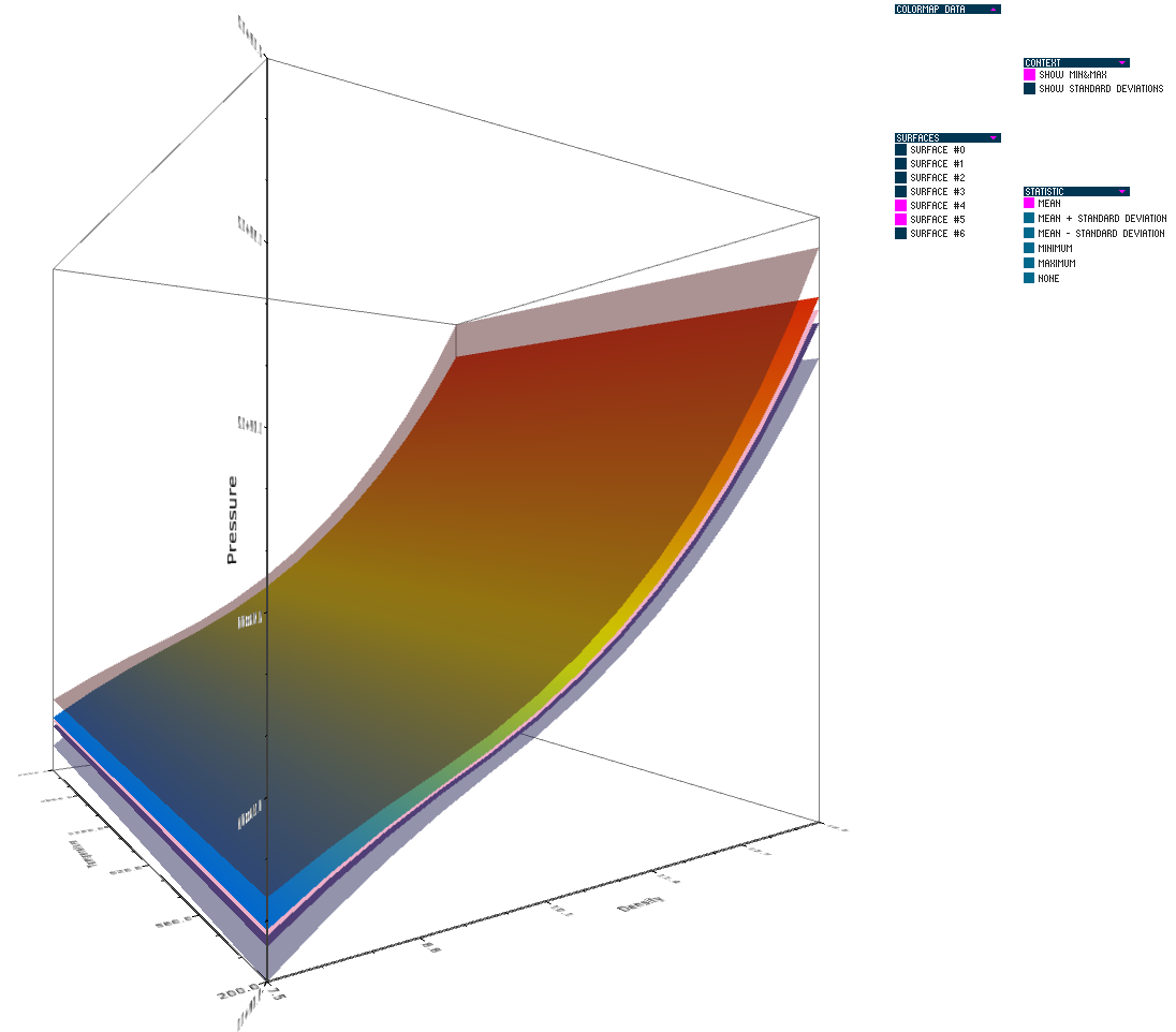
Uncertainty in the Development and Use of Equation of State Models V.G. Weirs, N. Fabian, K. Potter, L. McNamara, T. Otahal. In International Journal for Uncertainty Quantification, pp. 255--270. 2012. DOI: 10.1615/Int.J.UncertaintyQuantification.2012003960 In this paper we present the results from a series of focus groups on the visualization of uncertainty in Equation-Of-State (EOS) models. The initial goal was to identify the most effective ways to present EOS uncertainty to analysts, code developers, and material modelers. Four prototype visualizations were developed to presented EOS surfaces in a three-dimensional, thermodynamic space. Focus group participants, primarily from Sandia National Laboratories, evaluated particular features of the various techniques for different use cases and discussed their individual workflow processes, experiences with other visualization tools, and the impact of uncertainty to their work. Related to our prototypes, we found the 3D presentations to be helpful for seeing a large amount of information at once and for a big-picture view; however, participants also desired relatively simple, two-dimensional graphics for better quantitative understanding, and because these plots are part of the existing visual language for material models. In addition to feedback on the prototypes, several themes and issues emerged that are as compelling as the original goal and will eventually serve as a starting point for further development of visualization and analysis tools. In particular, a distributed workflow centered around material models was identified. Material model stakeholders contribute and extract information at different points in this workflow depending on their role, but encounter various institutional and technical barriers which restrict the flow of information. An effective software tool for this community must be cognizant of this workflow and alleviate the bottlenecks and barriers within it. Uncertainty in EOS models is defined and interpreted differently at the various stages of the workflow. In this context, uncertainty propagation is difficult to reduce to the mathematical problem of estimating the uncertainty of an output from uncertain inputs. Keywords: netl |
|
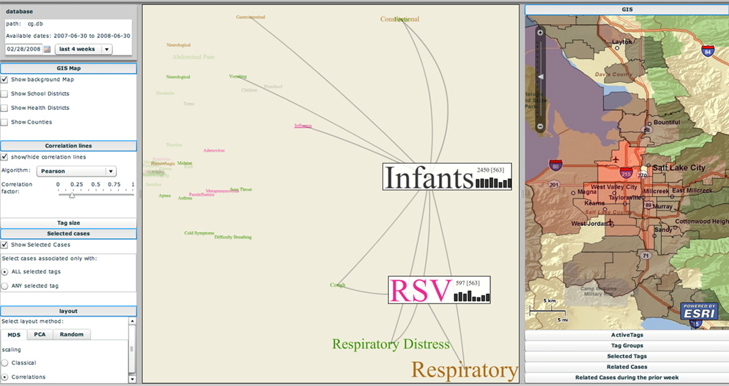
The EpiCanvas infectious disease weather map: an interactive visual exploration of temporal and spatial correlations P.H. Gesteland, Y. Livnat, N. Galli, M.H. Samore, A.V. Gundlapalli. In J. Amer. Med. Inform. Assoc., Vol. 19, Note: Awarded 1st place for Outstanding Research Article at ISDS 2012 and the Homer R. Warner Award at the AMIA Annual Symposium 2012, pp. 954--959. 2012. DOI: 10.1136/amiajnl-2011-000486 Advances in surveillance science have supported public health agencies in tracking and responding to disease outbreaks. Increasingly, epidemiologists have been tasked with interpreting multiple streams of heterogeneous data arising from varied surveillance systems. As a result public health personnel have experienced an overload of plots and charts as information visualization techniques have not kept pace with the rapid expansion in data availability. This study sought to advance the science of public health surveillance data visualization by conceptualizing a visual paradigm that provides an 'epidemiological canvas' for detection, monitoring, exploration and discovery of regional infectious disease activity and developing a software prototype of an 'infectious disease weather map'. Design objectives were elucidated and the conceptual model was developed using cognitive task analysis with public health epidemiologists. The software prototype was pilot tested using retrospective data from a large, regional pediatric hospital, and gastrointestinal and respiratory disease outbreaks were re-created as a proof of concept. |
|
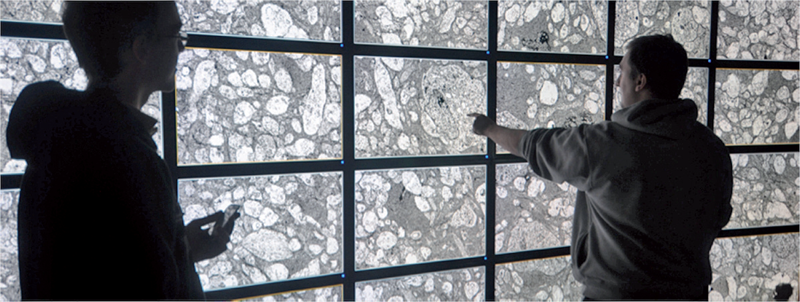
Biomedical Visual Computing: Case Studies and Challenges C.R. Johnson. In IEEE Computing in Science and Engineering, Vol. 14, No. 1, pp. 12--21. 2012. PubMed ID: 22545005 PubMed Central ID: PMC3336198 Computer simulation and visualization are having a substantial impact on biomedicine and other areas of science and engineering. Advanced simulation and data acquisition techniques allow biomedical researchers to investigate increasingly sophisticated biological function and structure. A continuing trend in all computational science and engineering applications is the increasing size of resulting datasets. This trend is also evident in data acquisition, especially in image acquisition in biology and medical image databases. For example, in a collaboration between neuroscientist Robert Marc and our research team at the University of Utah's Scientific Computing and Imaging (SCI) Institute (www.sci.utah.edu), we're creating datasets of brain electron microscopy (EM) mosaics that are 16 terabytes in size. However, while there's no foreseeable end to the increase in our ability to produce simulation data or record observational data, our ability to use this data in meaningful ways is inhibited by current data analysis capabilities, which already lag far behind. Indeed, as the NIH-NSF Visualization Research Challenges report notes, to effectively understand and make use of the vast amounts of data researchers are producing is one of the greatest scientific challenges of the 21st century. Visual data analysis involves creating images that convey salient information about underlying data and processes, enabling the detection and validation of expected results while leading to unexpected discoveries in science. This allows for the validation of new theoretical models, provides comparison between models and datasets, enables quantitative and qualitative querying, improves interpretation of data, and facilitates decision making. Scientists can use visual data analysis systems to explore \"what if\" scenarios, define hypotheses, and examine data under multiple perspectives and assumptions. In addition, they can identify connections between numerous attributes and quantitatively assess the reliability of hypotheses. In essence, visual data analysis is an integral part of scientific problem solving and discovery. As applied to biomedical systems, visualization plays a crucial role in our ability to comprehend large and complex data-data that, in two, three, or more dimensions, convey insight into many diverse biomedical applications, including understanding neural connectivity within the brain, interpreting bioelectric currents within the heart, characterizing white-matter tracts by diffusion tensor imaging, and understanding morphology differences among different genetic mice phenotypes. Keywords: kaust |
|
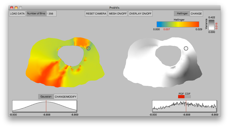
Interactive visualization of probability and cumulative density functions K. Potter, R.M. Kirby, D. Xiu, C.R. Johnson. In International Journal of Uncertainty Quantification, Vol. 2, No. 4, pp. 397--412. 2012. DOI: 10.1615/Int.J.UncertaintyQuantification.2012004074 PubMed ID: 23543120 PubMed Central ID: PMC3609671 The probability density function (PDF), and its corresponding cumulative density function (CDF), provide direct statistical insight into the characterization of a random process or field. Typically displayed as a histogram, one can infer probabilities of the occurrence of particular events. When examining a field over some two-dimensional domain in which at each point a PDF of the function values is available, it is challenging to assess the global (stochastic) features present within the field. In this paper, we present a visualization system that allows the user to examine two-dimensional data sets in which PDF (or CDF) information is available at any position within the domain. The tool provides a contour display showing the normed difference between the PDFs and an ansatz PDF selected by the user, and furthermore allows the user to interactively examine the PDF at any particular position. Canonical examples of the tool are provided to help guide the reader into the mapping of stochastic information to visual cues along with a description of the use of the tool for examining data generated from a uncertainty quantification exercise accomplished within the field of electrophysiology. Keywords: visualization, probability density function, cumulative density function, generalized polynomial chaos, stochastic Galerkin methods, stochastic collocation methods |
|
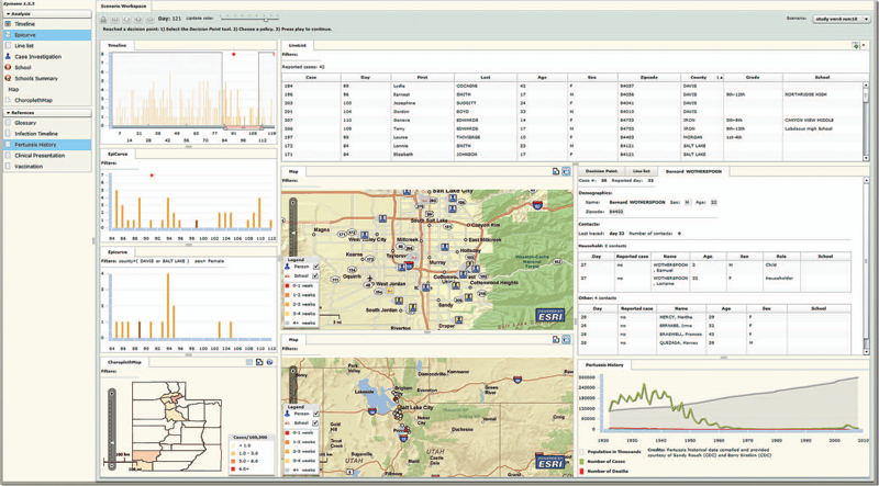
Epinome: A Visual-Analytics Workbench for Epidemiology Data Y. Livnat, T.-M. Rhyne, M. Samore. In IEEE Computer Graphics and Applications, Vol. 32, No. 2, pp. 89--95. 2012. ISSN: 0272-1716 DOI: 10.1109/MCG.2012.31 Effective detection of and response to infectious disease outbreaks depend on the ability to capture and analyze information and on how public health officials respond to this information. Researchers have developed various surveillance systems to automate data collection, analysis, and alert generation, yet the massive amount of collected data often leads to information overload. To improve decision-making in outbreak detection and response, it's important to understand how outbreak investigators seek relevant information. Studying their information-search strategies can provide insight into their cognitive biases and heuristics. Identifying the presence of such biases will enable the development of tools that counter balance them and help users develop alternative scenarios. We implemented a large-scale high-fidelity simulation of scripted infectious-disease outbreaks to help us study public health practitioners' information- search strategies. We also developed Epinome, an integrated visual-analytics investigation system. Epinome caters to users' needs by providing a variety of investigation tools. It facilitates user studies by recording which tools they used, when, and how. (See the video demonstration of Epinome at www.sci.utah.edu/gallery2/v/ software/epinome.) Epinome provides a dynamic environment that seamlessly evolves and adapts to user tasks and needs. It introduces four userinteraction paradigms in public health: • an evolving visual display, Using Epinome, users can replay simulation scenarios, investigate an unfolding outbreak using a variety of visualization tools, and steer the simulation by implementing different public health policies at predefined decision points. Epinome records user actions, such as tool selection, interactions with each tool, and policy changes, and stores them in a database for postanalysis. A psychology team can then use that information to study users' search strategies. |
|
From Quantification to Visualization: A Taxonomy of Uncertainty Visualization Approaches K. Potter, P. Rosen, C.R. Johnson. In Uncertainty Quantification in Scientific Computing, IFIP Advances in Information and Communication Technology Series, Vol. 377, Edited by Andrew Dienstfrey and Ronald Boisvert, Springer, pp. 226--249. 2012. DOI: 10.1007/978-3-642-32677-6_15 Quantifying uncertainty is an increasingly important topic across many domains. The uncertainties present in data come with many diverse representations having originated from a wide variety of domains. Communicating these uncertainties is a task often left to visualization without clear connection between the quantification and visualization. In this paper, we first identify frequently occurring types of uncertainty. Second, we connect those uncertainty representations to ones commonly used in visualization. We then look at various approaches to visualizing this uncertainty by partitioning the work based on the dimensionality of the data and the dimensionality of the uncertainty. We also discuss noteworthy exceptions to our taxonomy along with future research directions for the uncertainty visualization community. Keywords: scidac, netl, uncertainty visualization |
|
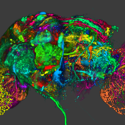
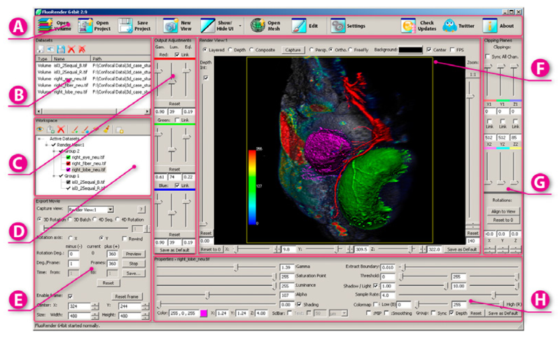
FluoRender: An Application of 2D Image Space Methods for 3D and 4D Confocal Microscopy Data Visualization in Neurobiology Research Y. Wan, H. Otsuna, C.-B. Chien, C.D. Hansen. In Proceedings of Pacific Vis 2012, Incheon, Korea, pp. 201--208. 2012. DOI: 10.1109/PacificVis.2012.6183592 2D image space methods are processing methods applied after the volumetric data are projected and rendered into the 2D image space, such as 2D filtering, tone mapping and compositing. In the application domain of volume visualization, most 2D image space methods can be carried out more efficiently than their 3D counterparts. Most importantly, 2D image space methods can be used to enhance volume visualization quality when applied together with volume rendering methods. In this paper, we present and discuss the applications of a series of 2D image space methods as enhancements to confocal microscopy visualizations, including 2D tone mapping, 2D compositing, and 2D color mapping. These methods are easily integrated with our existing confocal visualization tool, FluoRender, and the outcome is a full-featured visualization system that meets neurobiologists' demands for qualitative analysis of confocal microscopy data. Keywords: scidac |
|
Output-Coherent Image-Space LIC for Surface Flow Visualization J. Huang, W. Pei, C. Wen, G. Chen, W. Chen, H. Bao. In Proceedings of the IEEE Pacific Visualization Symposium 2012, Korea, pp. 137--144. 2012. Image-space line integral convolution (LIC) is a popular approach for visualizing surface vector fields due to its simplicity and high efficiency. To avoid inconsistencies or color blur during the user interactions in the image-space approach, some methods use surface parameterization or 3D volume texture for the effect of smooth transition, which often require expensive computational or memory cost. Furthermore, those methods cannot achieve consistent LIC results in both granularity and color distribution on different scales. This paper introduces a novel image-space LIC for surface flows that preserves the texture coherence during user interactions. To make the noise textures under different viewpoints coherent, we propose a simple texture mapping technique that is local, robust and effective. Meanwhile, our approach pre-computes a sequence of mipmap noise textures in a coarse-to-fine manner, leading to consistent transition when the model is zoomed. Prior to perform LIC in the image space, the mipmap noise textures are mapped onto each triangle with randomly assigned texture coordinates. Then, a standard image-space LIC based on the projected vector fields is performed to generate the flow texture. The proposed approach is simple and very suitable for GPU acceleration. Our implementation demonstrates consistent and highly efficient LIC visualization on a variety of datasets. |
| Design of 2D Time-Varying Vector Fields G. Chen, V. Kwatra, L.-Y. Wei, C.D. Hansen, E. Zhang. In IEEE Transactions on Visualization and Computer Graphics TVCG, Vol. 18, No. 10, pp. 1717--1730. 2012. DOI: 10.1109/TVCG.2011.290 |
Understanding Quasi-Periodic Fieldlines and Their Topology in Toroidal Magnetic Fields A.R. Sanderson, G. Chen, X. Tricoche, E. Cohen. In Topological Methods in Data Analysis and Visualization II, Edited by R. Peikert and H. Carr and H. Hauser and R. Fuchs, Springer, pp. 125--140. 2012. DOI: 10.1007/478-3-642-23175-9 |
| Mesh-Driven Vector Field Clustering and Visualization: An Image-Based Approach Z. Peng, E. Grundy, R.S. Laramee, G. Chen, N. Croft. In IEEE Transactions on Visualization and Computer Graphics, 2011, Vol. 18, No. 2, pp. 283--298. February, 2012. DOI: 10.1109/TVCG.2011.25 Vector field visualization techniques have evolved very rapidly over the last two decades, however, visualizing vector fields on complex boundary surfaces from computational flow dynamics (CFD) still remains a challenging task. In part, this is due to the large, unstructured, adaptive resolution characteristics of the meshes used in the modeling and simulation process. Out of the wide variety of existing flow field visualization techniques, vector field clustering algorithms offer the advantage of capturing a detailed picture of important areas of the domain while presenting a simplified view of areas of less importance. This paper presents a novel, robust, automatic vector field clustering algorithm that produces intuitive and insightful images of vector fields on large, unstructured, adaptive resolution boundary meshes from CFD. Our bottom-up, hierarchical approach is the first to combine the properties of the underlying vector field and mesh into a unified error-driven representation. The motivation behind the approach is the fact that CFD engineers may increase the resolution of model meshes according to importance. The algorithm has several advantages. Clusters are generated automatically, no surface parameterization is required, and large meshes are processed efficiently. The most suggestive and important information contained in the meshes and vector fields is preserved while less important areas are simplified in the visualization. Users can interactively control the level of detail by adjusting a range of clustering distance measure parameters. We describe two data structures to accelerate the clustering process. We also introduce novel visualizations of clusters inspired by statistical methods. We apply our method to a series of synthetic and complex, real-world CFD meshes to demonstrate the clustering algorithm results. Keywords: Vector Field Visualization, Clustering, Feature-based, Surfaces |
|
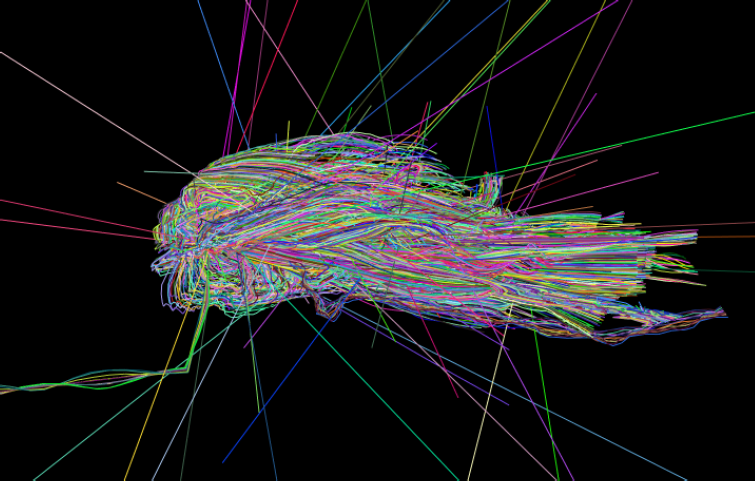
Simplification of Node Position Data for Interactive Visualization of Dynamic Datasets P. Rosen, V. Popescu. In IEEE Transactions on Visualization and Computer Graphics (IEEE Visweek 2012 TVCG Track), pp. 1537--1548. 2012. PubMed ID: 22025753 PubMed Central ID: PMC3411892 We propose to aid the interactive visualization of time-varying spatial datasets by simplifying node position data over the entire simulation as opposed to over individual states. Our approach is based on two observations. The first observation is that the trajectory of some nodes can be approximated well without recording the position of the node for every state. The second observation is that there are groups of nodes whose motion from one state to the next can be approximated well with a single transformation. We present dataset simplification techniques that take advantage of this node data redundancy. Our techniques are general, supporting many types of simulations, they achieve good compression factors, and they allow rigorous control of the maximum node position approximation error. We demonstrate our approach in the context of finite element analysis data, of liquid flow simulation data, and of fusion simulation data. |
| VisBricks: Multiform Visualization of Large, Inhomogeneous Data A. Lex, H. Schulz, M. Streit, C. Partl, D. Schmalstieg. In IEEE Transactions on Visualization and Computer Graphics (InfoVis '11), Vol. 17, No. 12, 2011. Large volumes of real-world data often exhibit inhomogeneities: vertically in the form of correlated or independent dimensions and horizontally in the form of clustered or scattered data items. In essence, these inhomogeneities form the patterns in the data that researchers are trying to find and understand. Sophisticated statistical methods are available to reveal these patterns, however, the visualization of their outcomes is mostly still performed in a one-view-fits-all manner, In contrast, our novel visualization approach, VisBricks, acknowledges the inhomogeneity of the data and the need for different visualizations that suit the individual characteristics of the different data subsets. The overall visualization of the entire data set is patched together from smaller visualizations, there is one VisBrick for each cluster in each group of interdependent dimensions. Whereas the total impression of all VisBricks together gives a comprehensive high-level overview of the different groups of data, each VisBrick independently shows the details of the group of data it represents, State-of-the-art brushing and visual linking between all VisBricks furthermore allows the comparison of the groupings and the distribution of data items among them. In this paper, we introduce the VisBricks visualization concept, discuss its design rationale and implementation, and demonstrate its usefulness by applying it to a use case from the field of biomedicine. |
| Context-Preserving Visual Links M. Steinberger, M. Waldner, M. Streit, A. Lex, D. Schmalstieg. In IEEE Transactions on Visualization and Computer Graphics (InfoVis '11), Vol. 17, No. 12, 2011. Evaluating, comparing, and interpreting related pieces of information are tasks that are commonly performed during visual data analysis and in many kinds of information-intensive work. Synchronized visual highlighting of related elements is a well-known technique used to assist this task. An alternative approach, which is more invasive but also more expressive is visual linking in which line connections are rendered between related elements. In this work, we present context-preserving visual links as a new method for generating visual links. The method specifically aims to fulfill the following two goals: first, visual links should minimize the occlusion of important information; second, links should visually stand out from surrounding information by minimizing visual interference. We employ an image-based analysis of visual saliency to determine the important regions in the original representation. A consequence of the image-based approach is that our technique is application-independent and can be employed in a large number of visual data analysis scenarios in which the underlying content cannot or should not be altered. We conducted a controlled experiment that indicates that users can find linked elements in complex visualizations more quickly and with greater subjective satisfaction than in complex visualizations in which plain highlighting is used. Context-preserving visual links were perceived as visually more attractive than traditional visual links that do not account for the context information. |
| Visualizing the Effects of Logically Combined Filters T. Geymayer, A. Lex, M. Streit, D. Schmalstieg. In Proceedings of the Conference on Information Visualisation (IV '11), IEEE, pp. 47--52. 2011. Filtering data is an essential process in a drill-down analysis of large data sets. Filtering can be necessary for several reasons. The main objective for filters is to uncover the relevant subsets of a dataset. Another, equally relevant goal is to reduce a dataset to dimensions to which either visualization or algorithmic analysis techniques scale. However, with multiple filters applied and possibly even logically combined, it becomes difficult for users to judge the effects of a filter chain. In this paper we present a simple, yet effective way to interactively visualize a sequence of filters and logical combinations of these. Such a visualized filter-pipeline allows analysts to easily judge the effect of every single filter and also their combination on the data set under investigation and therefore, leads to a faster and more efficient workflow. |
|
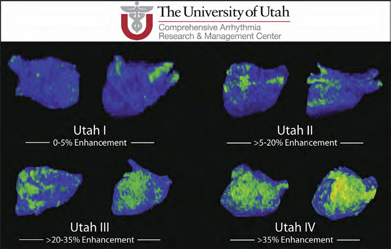
Atrial Fibrillation R.S. MacLeod, J.J.E. Blauer. In Multimodal Cardiovascular Imaging: Principles and Clinical Applications, Ch. 25, Edited by O. Pahlm and G. Wagner, McGraw Hill, 2011. ISBN: 0071613463 Atrial fibrillation (AF) is the most common form of cardiac arrhythmia so that a review of the role imaging in AF is a natural topic to include in this book. Further motivation comes from the fact that the treatment of AF probably includes more different forms of imaging, often merged or combined in a variety of ways, than perhaps any other clinical intervention. A typical clinical electrophysiology lab for the treatment of AF usually contains no less than 6 and often more than 8 individual monitors, each rendering some form of image based information about the patient undergoing therapy. There is naturally great motivation to merge different images and different imaging modalities in the setting of AF but also very challenging because of a host of factors related to the small size, extremely thin walls, the large natural variation in atrial shape, and the fact that fibrillation is occurring so that atrial shape is changing rapidly and irregularly. Thus, the use of multimodal imaging has recently become a very active and challenging area of image processing and analysis research and development, driven by an enormous clinical need to understand and treat a disease that affects some 5 million Americans alone, a number that is predicted to increase to almost 16 million by 2050. In this chapter we attempt to provide an overview of the large variety of imaging modalities and uses in the management and understanding of atrial fibrillation, with special emphasis on the most novel applications of magnetic resonance imaging (MRI) technology. To provide clinical and biomedical motivation, we outline the basics of the disease together with some contemporary hypotheses about its etiology and management. We then describe briefly the imaging modalities in common use in the management and research of AF, then focus on the use or MRI for all phases of the management of patients with AF and indicate some of the major engineering challenges that can motivate further progress. Keywords: ablation, carma, cvrti, 5P41-RR012553-10 |
| Scientific Discovery at the Exascale: Report from the (DOE) (ASCR) 2011 Workshop on Exascale Data Management, Analysis, and Visualization S. Ahern, A. Shoshani, K.L. Ma, A. Choudhary, T. Critchlow, S. Klasky, V. Pascucci. Note: Office of Scientific and Technical Information (OSTI), January, 2011. DOI: 10.2172/1011053 |
| Cyber Science and Engineering: A Report of the National Science Foundation Advisory Committee for Cyberinfrastructure Task Force on Grand Challenges J.T. Oden, O. Ghattas, J.L. King, B.I. Schneider, K. Bartschat, F. Darema, J. Drake, T. Dunning, D. Estep, S. Glotzer, M. Gurnis, C.R. Johnson, D.S. Katz, D. Keyes, S. Kiesler, S. Kim, J. Kinter, G. Klimeck, C.W. McCurdy, R. Moser, C. Ott, A. Patra, L. Petzold, T. Schlick, K. Schulten, V. Stodden, J. Tromp, M. Wheeler, S.J. Winter, C. Wu, K. Yelick. Note: NSF Report, 2011. This document contains the findings and recommendations of the NSF – Advisory Committee for Cyberinfrastructure Task Force on Grand Challenges addressed by advances in Cyber Science and Engineering. The term Cyber Science and Engineering (CS&E) is introduced to describe the intellectual discipline that brings together core areas of science and engineering, computer science, and computational and applied mathematics in a concerted effort to use the cyberinfrastructure (CI) for scientific discovery and engineering innovations; CS&E is computational and data-based science and engineering enabled by CI. The report examines a host of broad issues faced in addressing the Grand Challenges of science and technology and explores how those can be met by advances in CI. Included in the report are recommendations for new programs and initiatives that will expand the portfolio of the Office of Cyberinfrastructure and that will be critical to advances in all areas of science and engineering that rely on the CI. |